ChatGPT posters all look the same: why they hurt your brand, and how to fix it
A poster made in ChatGPT is fine when all you need is a quick ad. If you are building a brand, such as a new restaurant, a startup or a shop you want people to remember, it slowly works against you. The default ChatGPT look is now so common that customers recognise it at once, and then they cannot tell whose poster they saw. The fix is not to stop using AI. Decide your brand’s colours, fonts, photos and rules first, and make every poster follow them, whether a designer, a template or ChatGPT makes it.
This post shows what the generic look is, when it is harmless, why it costs a growing brand, and how to fix it yourself or with help. I work from Kathmandu, Nepal, where this trend has spread fast, but the same posters fill feeds in India, the US and everywhere else people open an image tool and type “make me a poster”.
The ChatGPT poster look is everywhere
Scroll Facebook or Instagram during any festival, sale or new menu launch and you will see it. Businesses of every kind, and plenty of individuals, post designs that could have come from the same hand, because in a sense they did. Here in Nepal I see it most around Dashain and Tihar, on restaurant doors in Kathmandu and on the Facebook pages of new cafés, colleges and startups. I am not going to name or show any business’s poster. The examples below were made with AI tools and contain no real business.
The tools are not the problem. They are fast and they make clean, bright images. The problem is that they all reach for the same answers when you leave the decisions to them. Ask for “a Dashain poster” or “a poster for my burger” without saying anything about your brand, and the tool fills every gap with the most common choice it knows. Everyone who asks the same way gets nearly the same poster.
Example 1: a festival greeting
I made this one in ChatGPT for this post with a simple Dashain prompt. The young man in it is not a real person.
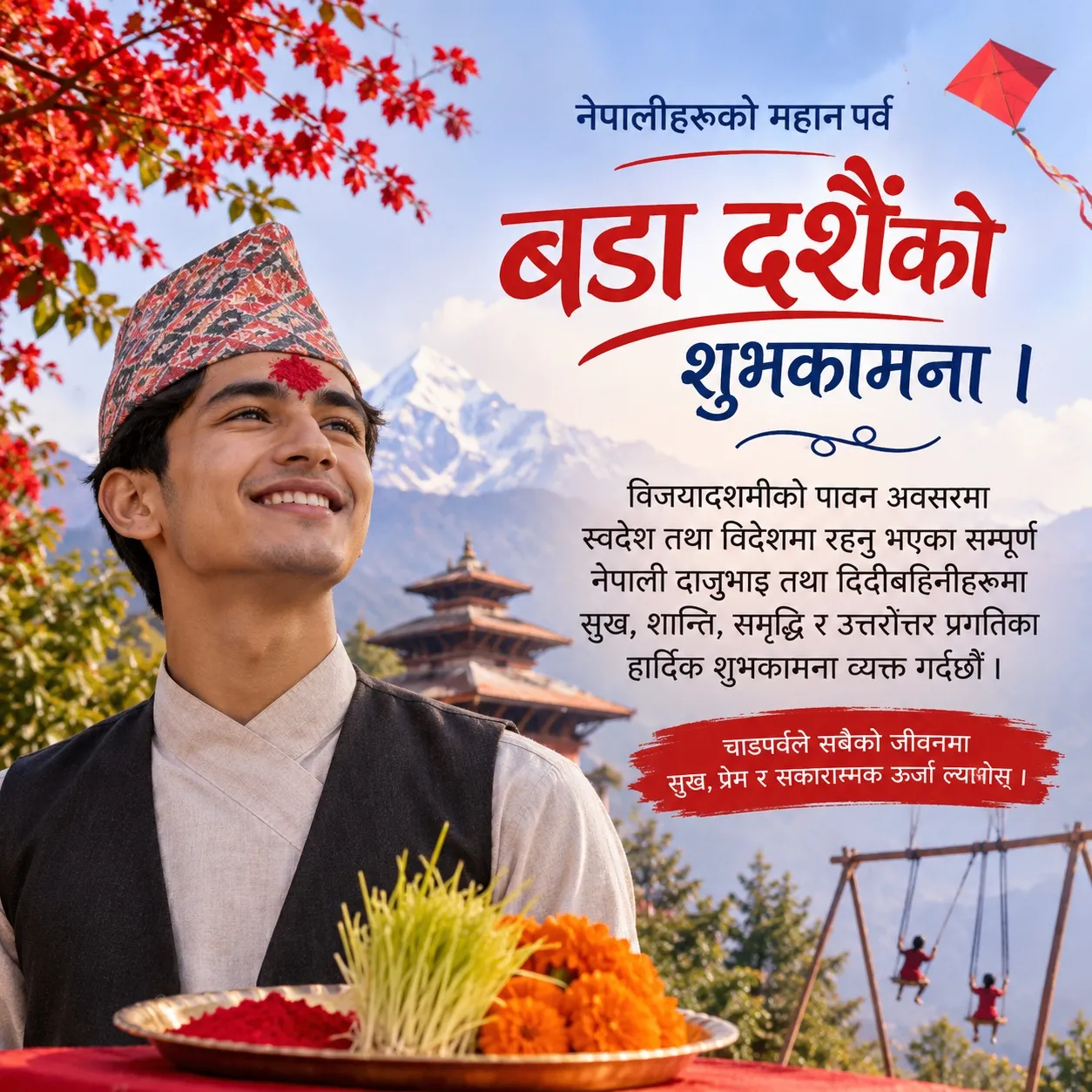
It looks polished at first glance. Now look at what gives it away, because you have seen every one of these before:
- Every festival symbol at once. Tika, jamara, marigolds, a kite, a ping (the bamboo swing), a pagoda and a Himalayan peak, all in one frame. A designer picks one idea. The tool includes everything it associates with the word “Dashain”.
- The same face. A smooth, perfect young person smiling and looking up into soft light. He appears in thousands of posters with a different topi.
- The same layout. A big red centred headline with a brush swoosh under it, a paragraph of formal wishes, and a red brush-stroke box for the last line.
- The same sky. Pastel blue, a soft glow, a snowy peak floating behind everything.
- Small spelling mistakes in the local script. This poster says सकारास्मक instead of सकारात्मक and उत्तरोंत्तर instead of उत्तरोत्तर, and the last word, ल्याओस्, is broken. Image tools still slip on Devanagari, and a Nepali reader spots it quickly. The same happens with Hindi, Arabic, Thai and other scripts.
None of these tells is a crime on its own. Together they say “nobody designed this”, and customers have learned to read that.
Example 2: the restaurant poster that every restaurant has
Restaurants are where I see this most. Here are two sets of AI restaurant posters. Both are sold as prompt templates on a prompt marketplace (the watermark in the corner is theirs), which means anyone can buy the prompt and produce the same look for their own menu. I show them only as examples of the style.
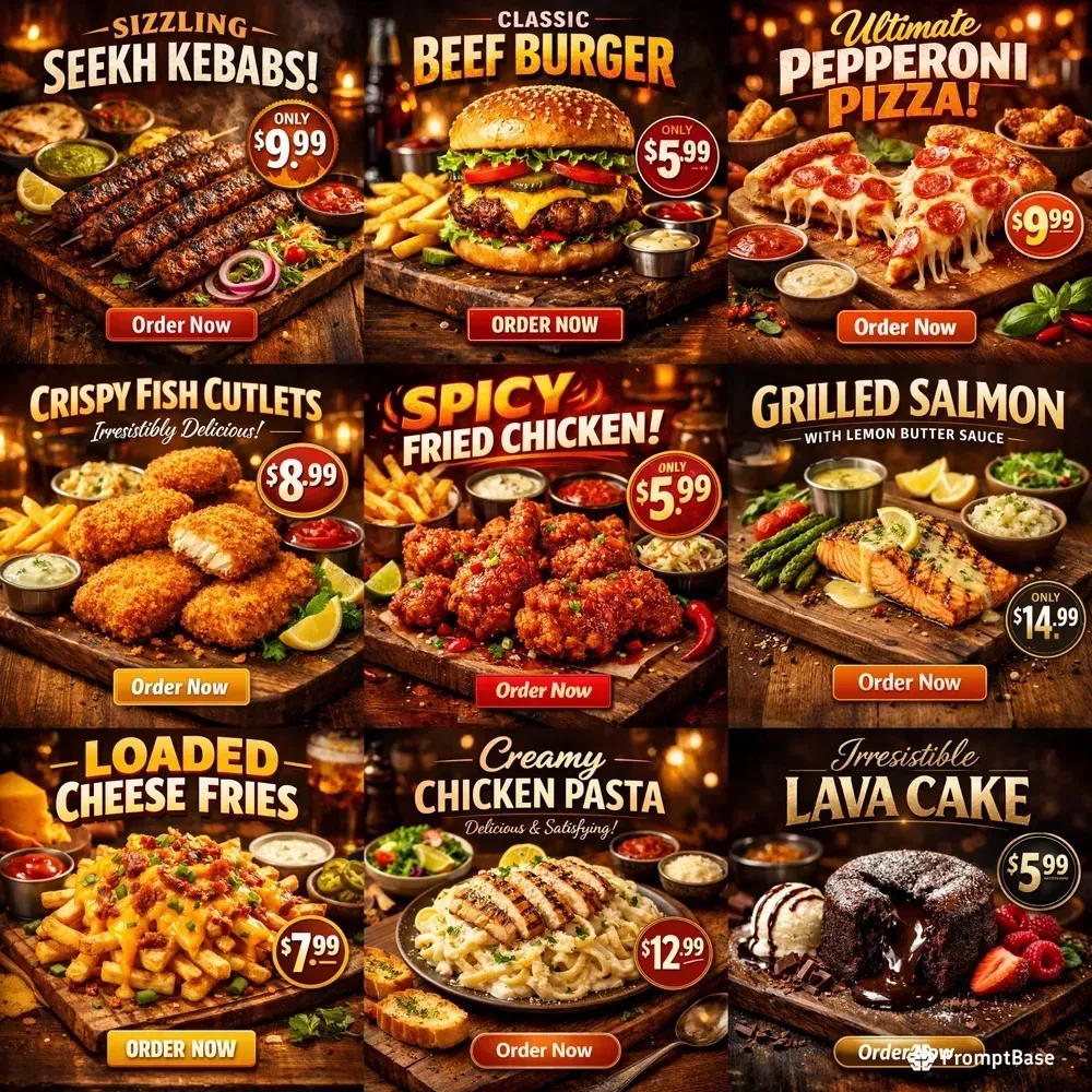
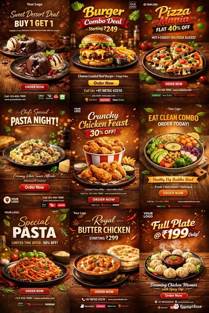
Eighteen posters, eighteen different dishes, one poster. Look at what repeats:
- A dark wooden table under every dish, with warm blurred lights in the background, as if every restaurant on earth were the same rustic steakhouse.
- A glossy gold or red headline with a bevel and a glow, in the same few script and bold fonts.
- A round price badge that says “Only” and a red or orange “Order Now” button.
- Small cups of sauce, herbs and lemon scattered around every plate, whatever the dish.
- Food that is too perfect. The cheese stretches the same way, the steam rises the same way, and no dish looks like it came out of a real kitchen.
- “Your Logo” in the corner. The second set is literally a template waiting for any restaurant’s logo. Burger, momo or butter chicken, in rupees or dollars, the poster is the same.
If your restaurant prints this on its door, the restaurant across the street can print the same thing tomorrow. And in my experience, more and more of them do.
How customers spot an AI-generated poster
People rarely say “this was made in ChatGPT”. They feel that a poster is generic and scroll on. These are the signs that trigger that feeling:
- Too many objects, each one a cliché of the topic.
- Faces that are smooth, symmetrical and lit from nowhere.
- Glossy, bevelled headline text with a glow, centred over the image.
- Spelling mistakes, broken letters or text that almost says something.
- Food or products that look like no real kitchen or shop made them.
- Warm, blurred lights or a pastel glow as the background, whatever the subject.
- A brush-stroke banner, a ribbon or a swoosh under the headline.
- The same layout on every post, but with no logo, colour or font the viewer could link to one business.
When a ChatGPT poster is fine
I use AI tools every day, so I want to be fair about this. A generated poster is a reasonable choice when:
- You are running a short ad to sell one product, and the only measure is clicks or orders this week.
- You are testing an offer to see if anyone responds before you spend money on it.
- You are not building a brand at all. You just want a sale, a notice or a one-time promotion out quickly.
- You need a rough idea to show a designer or a printer what you have in mind.
In those cases speed matters more than recognition, and the poster may do its job well. The trouble starts when a business that wants to be remembered uses the same look for everything, month after month.
Why the generic look hurts a brand you are building
People stop being able to tell whose poster it was
A brand is how people recognise you before they read your name. Your colours, your type, your photo style and your layout: over time these let a customer know a post is yours in half a second of scrolling. Marketing researchers such as Jenni Romaniuk call these distinctive brand assets, and they only work if nobody else uses them.
ChatGPT posters remove exactly that. When many businesses use the same tool with the same kind of prompt, they get the same style. I have seen so many of them that if I try to recall one, I may remember the swing or the smiling face or the dark wooden table, but I cannot say which business posted it. Try it yourself: think of the last three festival greetings or food posters you saw from businesses. Can you name whose they were?
Every poster you post is a chance to make people remember you. A generic poster spends that chance and gets nothing back, and so does the next one. Over a year, that is dozens of posts that built no memory.
Small mistakes look like carelessness
A spelling slip, a broken letter, or a dish photo that is clearly not from your kitchen tells a customer that nobody checked. Each post on its own is a small thing. Two years of them is your brand. For a restaurant this goes further: a customer who orders a dish from a picture expects that dish. When the plate looks nothing like the poster, the disappointment lands on you, not on the tool.
It gets more expensive to fix later
Rebranding a business that has posted two years of generic content means retraining customers who never learned what you look like. It is far cheaper to decide your look before your first post than to change it after your hundredth.
Things to know before starting a restaurant or startup
Most checklists for opening a restaurant or starting a business cover registration, tax, location, staff, suppliers and funding. In Nepal that means company registration, PAN and a lease; elsewhere the names change but the list is similar. Few checklists mention your look, and it costs very little to decide early. Before your first post, settle these:
- Your name and logo. Check that the logo still reads inside the small circle Facebook, Instagram, WhatsApp and Viber use for profile pictures, and in one colour for stamps and bills.
- Two or three colours, written down as colour codes, not “a nice green”.
- Your fonts: one for headlines and one for text. If you write in two scripts, as most businesses in Nepal do with Nepali and English, pick fonts that suit each other.
- Your photo style: real photos of your food, shop, team or product, taken in the same light and framing.
- Your voice: formal or friendly, local language or English, and when you use each.
- Where you will be seen: a door poster, a menu, a delivery app, a website, an app store. Each has its own sizes, and your look has to survive all of them.
For a startup, add your pitch deck, website and app store listing to the list. Investors and early users see those before they see your social posts.
How to fix it yourself: a one-page brand sheet
If you have some design sense and want to keep costs down, you can do this on your own. Put everything on one page and follow it every time, whether you design in Canva, Figma, ChatGPT or anything else.
Colours
Pick a main colour, a background colour and one accent. For a restaurant, that might be a deep green (#1F4D3A), a warm cream (#F4EAD5) and a chilli red (#C8372D) used only for prices and offers. Check that your text is readable on your background on a phone in sunlight. Every poster uses these colours and nothing else.
Fonts
Choose one headline font and one text font, and never let a tool choose for you. If you use a script other than Latin, choose fonts that support it properly. For Nepali, that means proper Devanagari, so conjuncts and the short i sign sit correctly. Mukta, a free font, covers both Devanagari and English, which makes it an easy start for a Nepali business.
Photos
Use real photos. For food, photograph each dish on your own plates, near a window in daylight, from the same angle each time. A phone is enough. One consistent background, like your own table, already makes your posts look like a set.
Templates
Make three layouts: an offer, a greeting and a notice. Keep the logo and the price in the same place each time. Variety comes from the photo and the words, not from a new layout every week.
Guardrails
Write a short list of what your posters never use, and check every design against it before you post:
- No generated people pretending to be your staff or customers.
- No generated food. Show the dish from your kitchen.
- No pile of festival symbols. One idea per poster.
- No glowing sky, dark wooden table, brush swoosh, ribbon or glossy gold headline unless they are part of your brand.
- No text in any language that a person has not read letter by letter.
- No logos of apps or platforms you are not actually on.
How to use ChatGPT without getting the ChatGPT look
You can keep using ChatGPT. Just stop letting it make the decisions.
- Give it your brand sheet first. In ChatGPT you can create a project and put your brand sheet in its instructions and files: your colour codes, font names, logo, guardrails and two or three of your best past posters. Every chat in that project starts from your brand, not from zero.
- Ask for parts, not the whole poster. Use it to clean up your own food photo, extend a background, or suggest three layout ideas. Then set the text yourself, in your own fonts, in Canva or another editor. Image tools are still unreliable with text, especially in Nepali and other non-Latin scripts.
- Show, don’t describe. Upload a past poster you like and say “same layout, same colours, new dish”. A reference beats a paragraph of adjectives.
- Name what to avoid in your review, not only in your prompt. Check every result against your guardrails. If you write “no wooden table” in a prompt, the tool may still give you one, so reject it and try again.
- Look at it where people will see it. Check the poster on a phone at feed size, and print a test before a big run. If it still looks like the examples above, start again.
Even a business that never hires anyone should spend an afternoon on this. It is the cheapest brand work you will ever do. If you want the longer version of how I direct AI images, read AI branding without the slop.
How Appynox can help: AI speed, a designer’s eye
If you would rather hand this over, that is what we do at Appynox, the AI-first agency I co-founded in Lalitpur, Nepal. We use AI too. The difference is how: we have our own tools and a lot of practice directing them, and a designer on our team sets the look and checks every piece. That usually makes us faster and cheaper than a conventional agency that does everything by hand, while your posters still look like yours. We work with businesses in Nepal and abroad, and you can work with us in three ways.
1. One-time branding you can reuse in ChatGPT
We build your brand once and hand it to you. The kit includes:
- Your colour palette with exact colour codes, and the fonts to use for each language.
- Your logo files and the rules for using them.
- Templates for your most common posts: offers, greetings, notices and new items.
- A written set of guardrails: what your brand always does and never does.
- A ChatGPT instruction file and sample prompts, ready to load into a project.
From then on you or your staff make your own posters, again and again, and they follow your brand instead of the generic look. There is no monthly fee.
2. Long-term support
For a restaurant or a new brand that would rather not think about design every week, we work as a partner, month after month: social posts, festival greetings, menus, banners and delivery-app images, all designed to your brand sheet. The brand stays consistent because the same people hold it.
3. Advice only
If you want to do it yourself, book a session. We look at what you post today and tell you what to keep, what to change and how to set up your own brand sheet.
Questions people ask
Is it bad to use ChatGPT for posters?
No. It is a good tool for quick ads, tests and rough ideas. It becomes a problem when a business that wants to be remembered lets it decide the look of every post.
Can ChatGPT keep my brand colours and fonts?
Partly. It follows colour codes and reference images reasonably well when you give them. It is less reliable with exact fonts and text, so the safest workflow is to generate images and set the text yourself.
How much does branding cost?
It depends on what you need: a one-time brand kit, a month of posts, or a full identity with menus and signage. We do not publish prices, and you get a written quote before any work starts.
Start with your brand sheet
The details and examples are on my AI graphic design and branding page, and if your business is in Nepal, on graphic design and branding in Nepal, where you can also message me on WhatsApp or Viber. If you are opening a restaurant or starting a business and want to get the look right from day one, book a 30-minute call. Tell us which of the three options fits, or let us help you choose.